Statistics were part of our everyday lives long before anyone had heard of COVID-19. Pick up a newspaper any day of the week and see how many stories you find that depend on statistics. You don’t even need to get to the sports section. These days we’re bombarded by COVID-19 statistics: number of new cases, number of deaths, number of ICU beds, rate of positive tests. How can we digest all the data? More important, how do we distinguish between lies and statistics?
There is something fascinating about science. One gets such wholesale returns of conjecture out of such a trifling investment of fact.—Mark Twain, Life on the Mississippi
In his classic book How to Lie with Statistics, Darrell Huff outlines five questions to help us tell the difference between lies and statistics.
Question 1: Who says so?
First, look for bias. That is, does the person have an interest in a particular outcome? This is one reason why it matters who the author is. Both the byline and the acknowledgment are important here. You’d read a report on a new drug more skeptically if you knew the author worked for the company that makes that drug. You’d read with similar skepticism if you knew the drug company paid for the study. The study may be impeccable, but there’s clearly a potential for bias in the reporting.
It isn’t always obvious that someone has a financial or other interest. Sometimes unscrupulous expert witnesses testify to what amounts to junk science. To bolster their credibility, they may try to publish papers in support of their testimony. Unfortunately, peer review doesn’t keep all such papers from seeing the light of day.
Financial interest isn’t the only source of bias. For example, someone may have staked his professional reputation on a particular theory. That person may continue to promulgate his theory even if the evidence isn’t strong—or if it points in a different direction. Some years ago an engineer wanted to bring back the coarsely ground cements of decades past. He maintained (with some truth) that today’s rapidly reacting cements contribute to cracking in concrete. However, his enthusiasm for his cause led him to misrepresent the data.
In one publication he cited a report on a condition survey of comparable bridge deck overlays made with and without silica fume. Two percent of the silica-fume concrete overlay had debonded from the substrate, while 1% of the area of the control overlay had debonded. From an engineering standpoint, both results are excellent—and essentially equal (98% and 99% bonded, respectively). But this engineer was more interested in making his point, so he reported that the silica-fume overlay showed twice as much debonded area. That was literally true, but misleading.
Question 2: How does he know?
If you’re reading a scientific publication or an engineering report, you can examine the methodology in detail because that’s an essential part of the reporting. In a news item, though, the reporter will omit some details for lack of space and may not fully understand them anyway. How do you distinguish between lies and statistics in that case?
Usually you’ll have something to go on if you read beyond the headlines. Look at how the graphics present the data. Do they show the origin (zero) so you can see the overall picture? Or do they zoom in on just one part, making the changes in the y-values look bigger than they are?
If the data are from a poll or other sample, how large is the sample? Is is large enough to mean anything? Was it a truly random sample, or is there an inherent bias in the sampling technique? For example, an internet survey will count only people with internet access who choose to respond. That’s two sources of bias in one survey.
Be skeptical about correlations. It’s easy to juxtapose any two (or more) factors that occur together and come up with a statistical correlation. However, correlation is not causation. If you observe A and B together, it may be that A caused B, B caused A, something else caused both A and B, or that it’s simply a coincidence. Mere correlation can’t tell you which is the case. Be wary of reporting that implies or states that it does.
Statistical analysis is at the heart of natural experiments. In this case we can’t control the experimental conditions, so it really matters that we accurately compare the different groups.
Question 3: What’s missing?
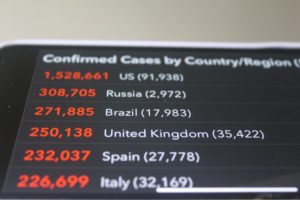
Sometimes important details are missing. For example, what is the basis for comparison? Every day in the news we hear about the number of deaths due to COVID-19. That figure is usually reported as just that, but a context would be helpful. Number of deaths per 100,000 population would be more meaningful. So would comparison with other states or countries in terms of deaths per 100,000 population.
Because of the limitations of testing in this country, it’s very likely that the mortality figures we hear on the news are biased low. That is, more people have died of COVID-19 than we know of, especially in the first few months of this year. In poorer countries, many people do not receive medical attention, so their deaths are not counted even now. Another useful comparison would be the number of excess deaths—that is, how many more deaths are we seeing now than we’d normally have in a comparable period? Of course this number will include not only deaths due directly to COVID-19, but also deaths due to people’s reluctance to seek medical care for other conditions as well as increases in deaths due to unrelated causes. But it would give us an upper-bound estimate.
Watch out for averages. In common usage, “average” refers to the arithmetic mean—that is, the total value of all data points divided by the number of data points. But there are two other ways to measure the central point: median and mode. Half of the data points are above the median value and half are below it. The mode is the value that is the most common. For a normal distribution, all three measures of the central point are the same, but not all data have a normal distribution. For example, mean household income could be skewed high because of a few very wealthy households. But the median will show whether most households have much less to live on, and the mode will better reflect the “typical” household. As economic inequality increases, these other measures become more informative than the mean.
This summer I experienced an example of missing context when I needed to find a new tenant for my condominium. Having heard of the millions of job losses and defaults on rent, I was concerned about being able to rent the place at all. But the property manager assured me that those economic woes are concentrated in an entirely different sector of the market. That is, the burden of the job losses has fallen disproportionately on low-wage workers, who couldn’t afford the rent on this condo anyway. And indeed, it took less than a week to find a new tenant.
Question 4: Did somebody change the subject?
When the public first became aware of COVID-19, it was difficult to obtain testing. As testing became more widely available, the number of confirmed cases rose considerably. President Trump insisted that increased testing would increase the number of cases. He was half right: the number of confirmed cases would increase. That is, we need to distinguish between the cases we count and the cases that actually exist. Better counting doesn’t increase the number that exist, but it does increase the number we include.
It’s important to know how the reporting is done. In some cases subjects are reporting on themselves. Depending on how anonymous the survey is, they may have an incentive to make themselves appear a bit better than they are. For example, in exit polls, voters may not be willing to admit that they voted for certain candidates or ballot measures. The bias can be even greater if they’re reporting on what they remember rather than keeping track of the details in real time. Distinguishing between lies and statistics in such cases requires some understanding of human nature.
Question 5: Does it make sense?
Lastly, if you want to tell the difference between lies and statistics you need to step back and look at the overall picture. Is the whole thing based on a dubious assumption? For example, I write these blogs to be understandable by the general reader. Among the tools the software uses is the Flesch readability formula, which uses the lengths of the words and sentences to assess readability. It’s an easy and objective thing to measure, but does it really correlate with readability? A friend of mine says that with some of my more technical blogs, she understands all the words but doesn’t understand what I’m saying. Is that really readable?
Sometimes we want to forecast events in the near- or distant future. Naturally we can’t know the future, so the best we can do is to extrapolate from the past. It’s important to consider what the underlying assumptions are. Is there reason to expect that everything will continue exactly as it has so far? What might change, and in what way? What difference would it make? This is why it’s helpful to use more than one model. It’s also why we shouldn’t trust too much in models.
Overly precise conclusions should make us suspicious. Some years ago I served as an expert witness in a construction lawsuit. One of the opposing experts used a model to predict the progress of deterioration of the concrete. He predicted the depth of deterioration to the nearest millimeter, with no margin of error. I advised my client to call him on it: core the concrete and see how far we had to go to get to undamaged material. The case settled before we had the chance to try it, but I’m pretty sure we would have proved him wrong. No prediction should be that precise.
More recently, I’ve read reports by other experts investigating various construction defects. Sometimes they’re of high quality, clearly based on reliable data and observations. On the other hand, some read like Through the Looking Glass and What Alice Found There. That is, the conclusions don’t follow logically from the data or the words are used to mean something other than their normal definitions.
Lies and statistics
As you can see, it pays to look beyond the headline statistics to examine where they come from. Does the person gathering the data have some interest in reporting them in a certain way? Were they even trying to be objective? What methodologies did they use? Was the sample big enough to be meaningful? How representative was it? Are we comparing apples with apples? Would a proper context help us understand it better or differently?
Tim Harford, a British economist and author about communicating statistics clearly, provides an even simpler way to think through what statistics are telling us: (1) be calm, (2) get context, and (3) be curious. That is, don’t get carried away by emotional reactions, but understand the context the statistics portray. And be willing to dig a little deeper to find out what’s really going on.